Pyramid supports two kinds of KPI charts: gauges and bullet charts. Formatting functions for KPI charts customize the look and feel of the chart. Using a combination of formatting functions, users have a lot of control over how the chart will look, and what information the reader's attention should be drawn to.
KPI Formatting Settings
By default, the dropdown list at the top of the Formatting panel reflects the KPI chart type:
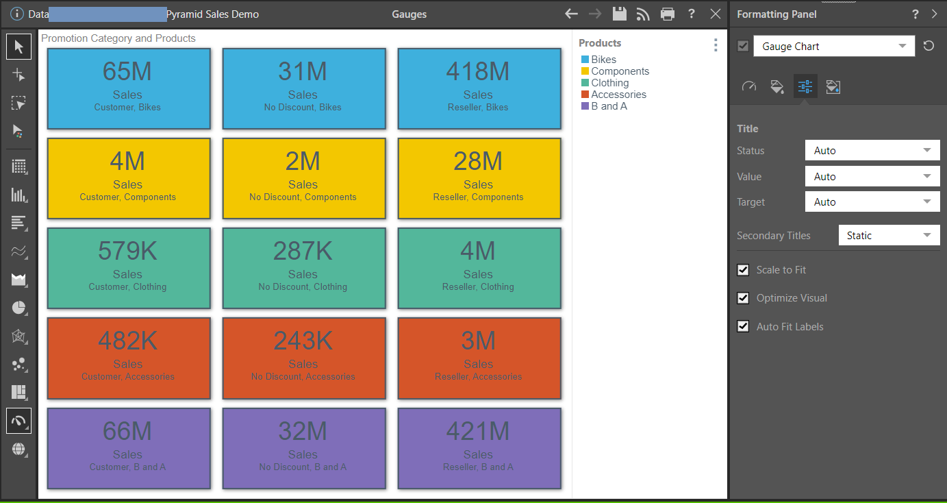
- Gauge Chart: Formatting tools for Gauges allow you to change the design of the gauges, change the background color, and scale the chart down to fit the canvas.
- Bullet Chart: Formatting tools for the Bullet chart enable you to change the design of the "bullets", change the background color, and scale the chart down to fit the canvas.
Additional Formatting Settings
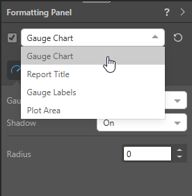
For each KPI chart, other items can also be formatted from the Formatting panel. To access these options, select them from the dropdown list at the top of the Formatting panel:
Bullet Charts
- Report Title: Customize the report title.
- Indicators: Change the colors for the bullet chart indicators.
- Scale: Show or hide the scale and adjust the scale font.
- Plot Area: Customize the plot area by changing the background color, adding borders, and, where applicable, changing the axes.
- Y-Trellis Axis: Show or hide trellis labels and edit fonts.
- Color: Customize the fill type and color for Gauge and Bullet shapes.
Gauge Charts
- Report Title: Customize the report title.
- Gauge Labels: Customize the labels on the gauge charts.
- Legend: Edit the legend by changing its position, layout, and fonts.
- Plot Area: Customize the plot area by changing the background color, adding borders, and, where applicable, changing the axes.
- Color: Customize the fill type and color for Gauge and Bullet shapes.